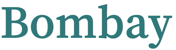
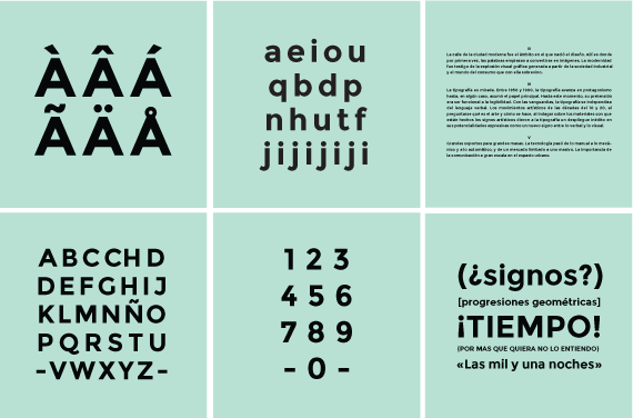
my favorite fonts/typefaces
design inspiration design fonts
14 Oct 2015- where to get the font: google fonts
- How to use google fonts
- the basic classes: sans, serif, slab-serif,
- weights:
The majority of fonts on this list are sans, simply because on web/mobile interfaces people don’t often read long text and hence the sans typeface will be the best choice
Sans-serif:
1. work-sans
If you are looking for something that gives you that magazine vibe this is your font

2. montserrat homepage
This font literally looks like Helvetica but with a twist, Its characters are wider.
3. Source sans pro homepage
If you are doing anything to do with code then this would be your best way to keep people
within that context even when they are not looking at code. Its sister font being “source code pro”.
Looks a lot like Whitney A typeface
4. Lato homepage
It looks rather rounded but its fine. similar to proxima nova
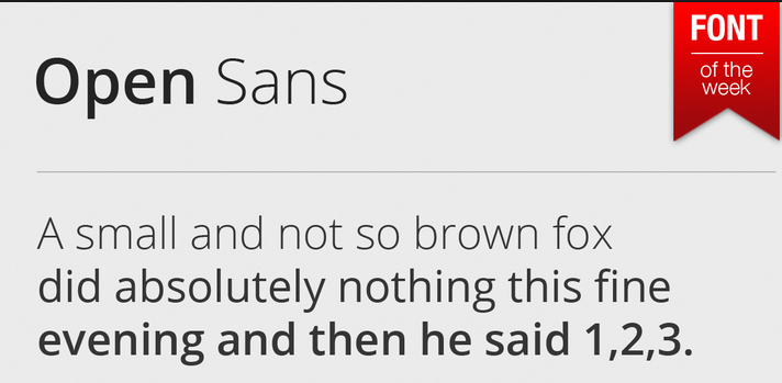
5. open sans
This was a font that I thought was the natural successor to Helvetica and Arial.
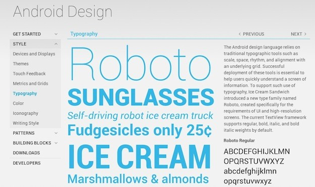
6. Roboto
I fell in love with this font when they shipped this with android.
Serifs:
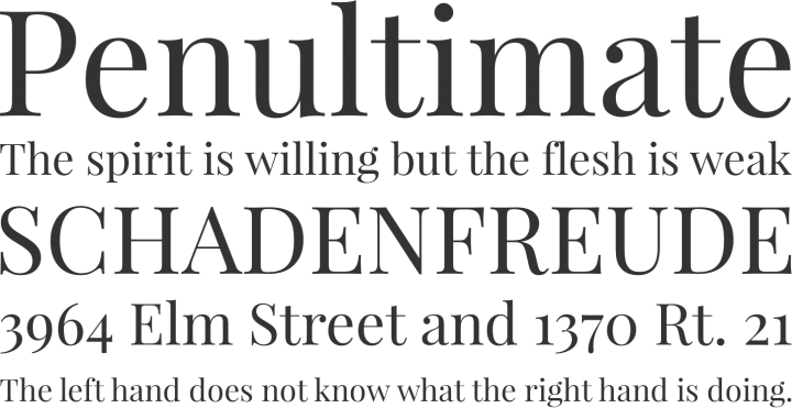
1. playfair display
In case you wanted that clarendon feel to your design
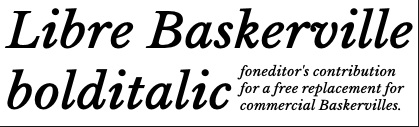
2. libre baskerville
Baskerville is a really nice font when its italicised. You get that old book text feel.
Slab Serifs:
1. source serif pro
Another free font from the adobe.